最近做项目时,用了不少 CSS3 的 flex 布局,感觉非常棒,比老式布局方式(position+display+float)好用得多,所以打算写一篇文章总结一下。
flex 的基本概念
两个关键词:
- flex 容器(flex container)
- flex 项目(flex items)
容器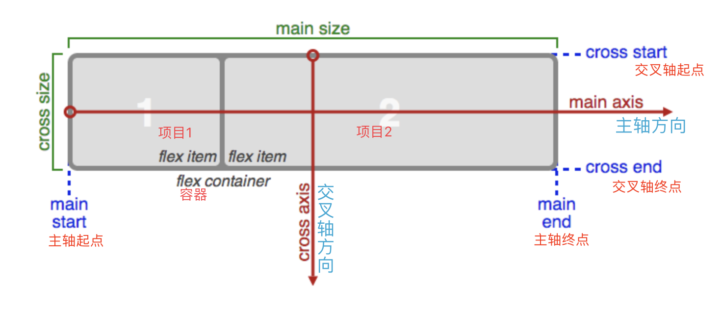
容器属性
| 属性 | 取值 | 解释 |
|---|---|---|
display |
flex or inline-flex |
对应块级或行内元素 |
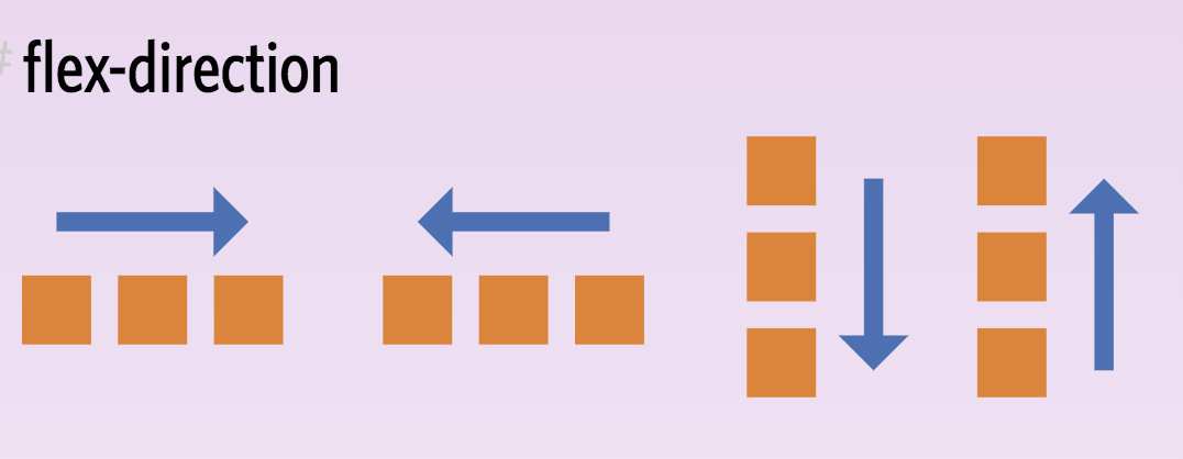
flex-direction |
row(default); row-reverse; column; column-reverse |
 |
flex-wrap |
nowrap(default); wrap; wrap-reverse |
nowrap 一行显示,wrap 多行显示 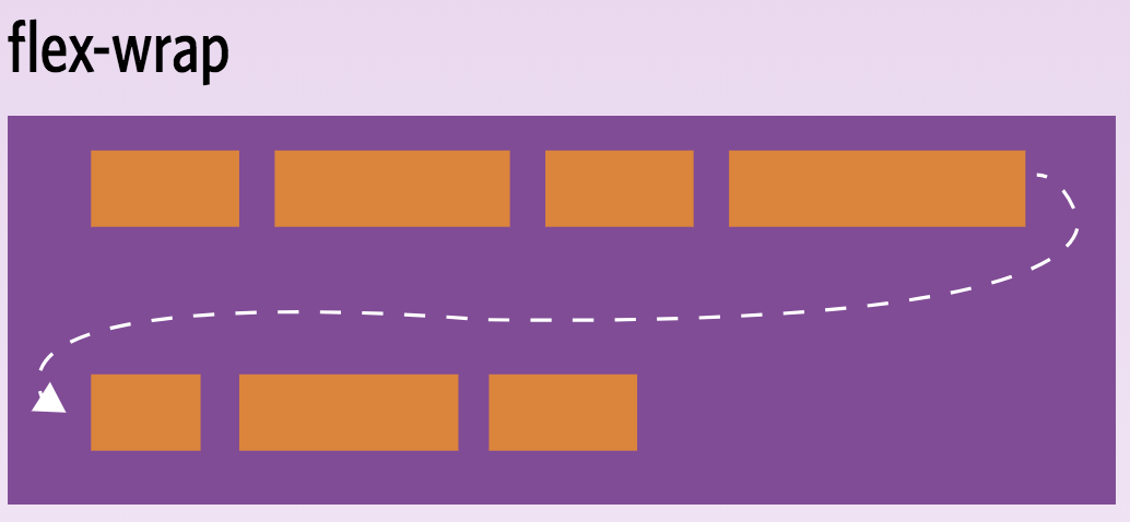 |
flex-flow |
<flex-direction> <flex-wrap> |
简写,默认是row nowrap |
justify-content |
flex-start; flex-end; center; space-between; space-around; space-evenly |
项目沿主轴对齐方向,其实是规定如何分配空间 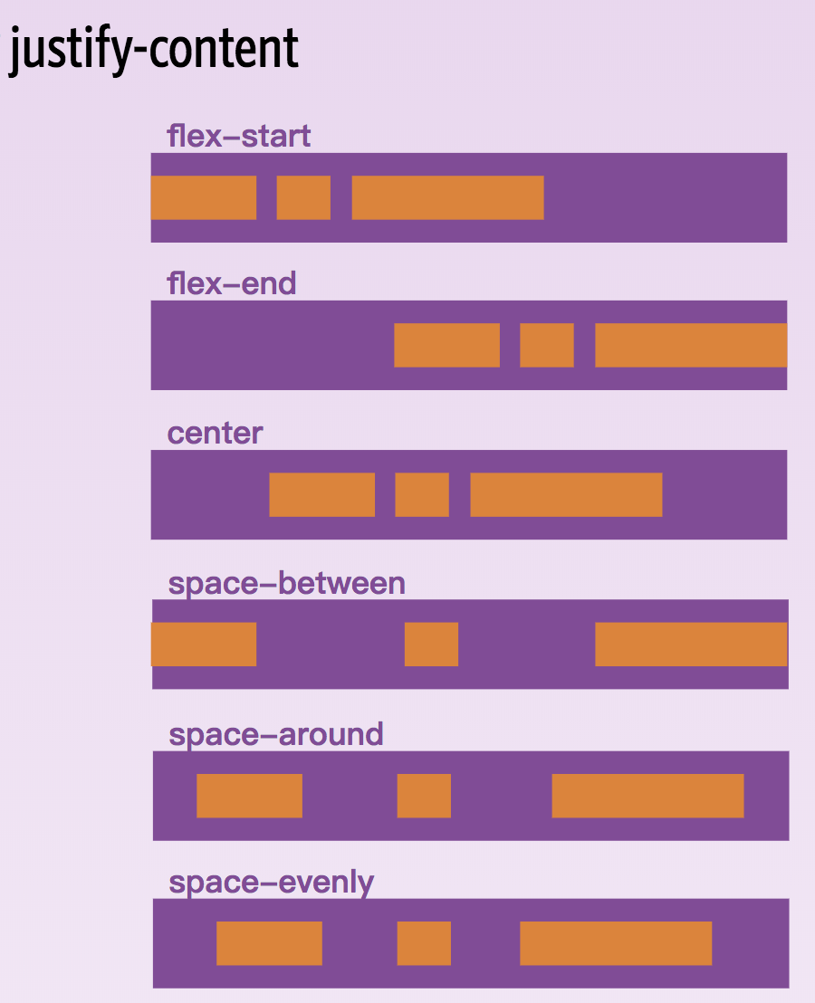 |
align-items |
flex-start; flex-end; center; baseline; stretch |
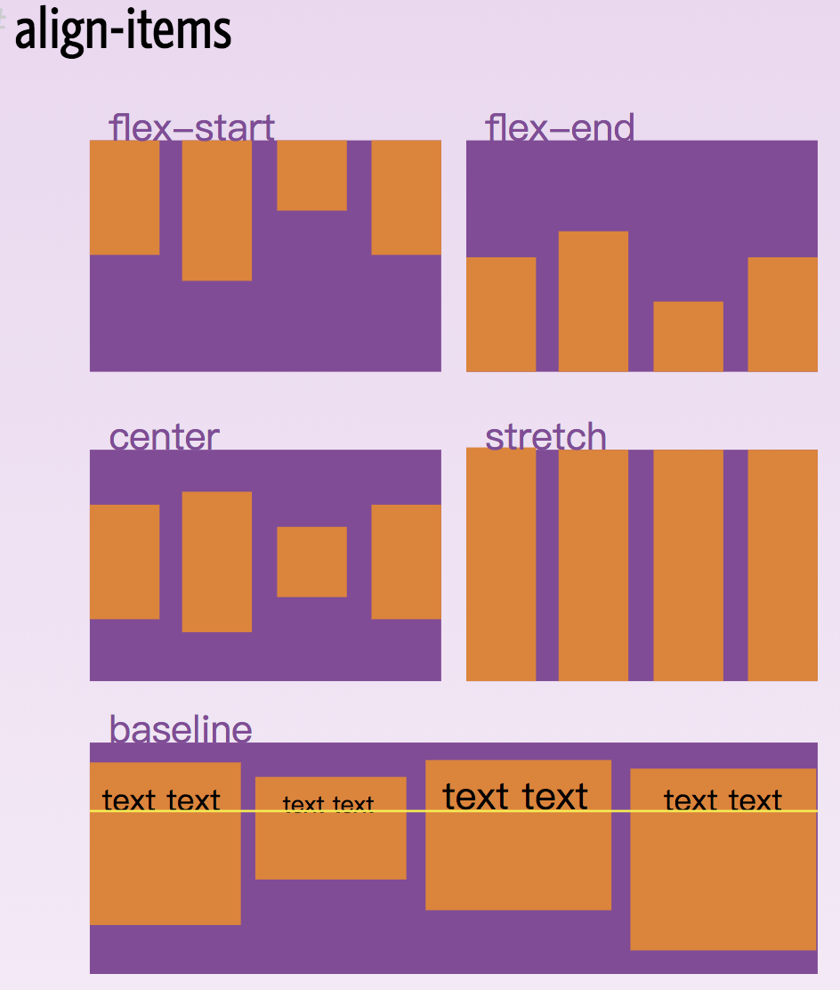 |
align-content |
flex-start; flex-end; center; baseline; stretch |
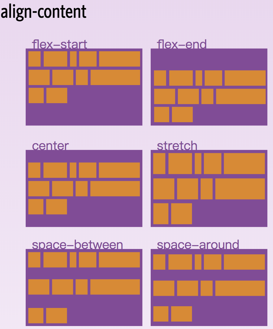 |
项目属性
| 属性 | 取值 | 解释 |
|---|---|---|
order |
<integer>默认为0 |
规定项目排列顺序,默认按照文档中出现的顺序排列 |
flex-grow |
<number>默认为0 |
规定有剩余空间时,项目如何放大。例如如果都设为1,则都等比例放大;如果一个设为2,其他设为1,则这一个放大倍数是其他的2倍,其他均分 |
flex-shrink |
<number>默认为1 |
负数无效;规定项目缩放比例 |
flex-basis |
<length>默认为auto |
定义在分配剩余空间前元素的默认尺寸,默认值为auto,即项目的本来大小, 它可以设为跟width或height属性一样的值(比如350px),则项目将占据固定空间 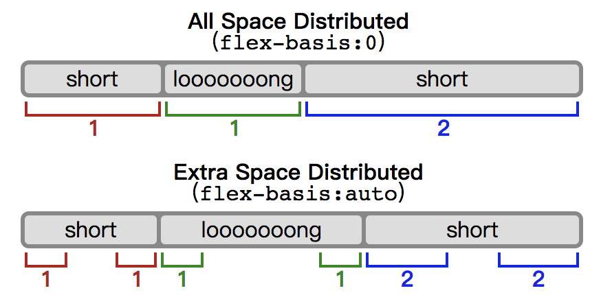 |
flex |
none 或 [<flex-grow> <flex-shrink> <flex-basis>] |
默认为0 1 auto |
align-self |
auto; flex-start; flex-end; center; baseline; stretch |
覆盖align-items属性 |
引用
- Note: Flexbox layout is most appropriate to the components of an application, and small-scale layouts, while the
Grid layoutis intended for larger scale layouts.- Note that
float,clearandvertical-alignhave no effect on a flex item.- all of the
column-*properties have no effect on a flex container.- the
::first-lineand::first-letterpseudo-elements do not apply to flex containers.
最佳实践
- 目前各主流浏览器已基本完全支持 flex 布局方式
- 移动端和各种屏幕适配的场景适合使用 flex 布局
- flex 是一维的布局方案,grid 是二维布局方案;grid 适合于大型布局,但目前兼容性不太好
- flex 的子元素设置 z-index 会创建新的层叠上下文
示例
1 | // 居中 |
更多示例请访问大牛们的总结: